PROBLEM OVERVIEW
Art museums are designed to educate, enrich, and inspire the local communities they reside in. However, museum visitors are often faced with busy crowds, time constraints, clunky technology, and meandering exhibition halls which can contribute to an overwhelming experience.
“How might we design an app that elevates the art museum experience and helps visitors get the most from their visit.”
ROLE
Research, UX/UI, and Product Design
TIMELINE
May 2022 - August 2022
PROCESS
Research, surveys, interviews, competitive analysis, ideation, prototyping, testing, analysis
TOOLS
Figma, Miro, Maze
Surveys & Interviews
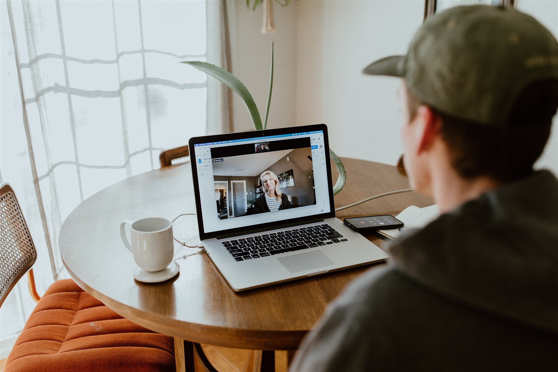
The research process began by sending out online surveys geared toward learning more about the "users" of art museums.
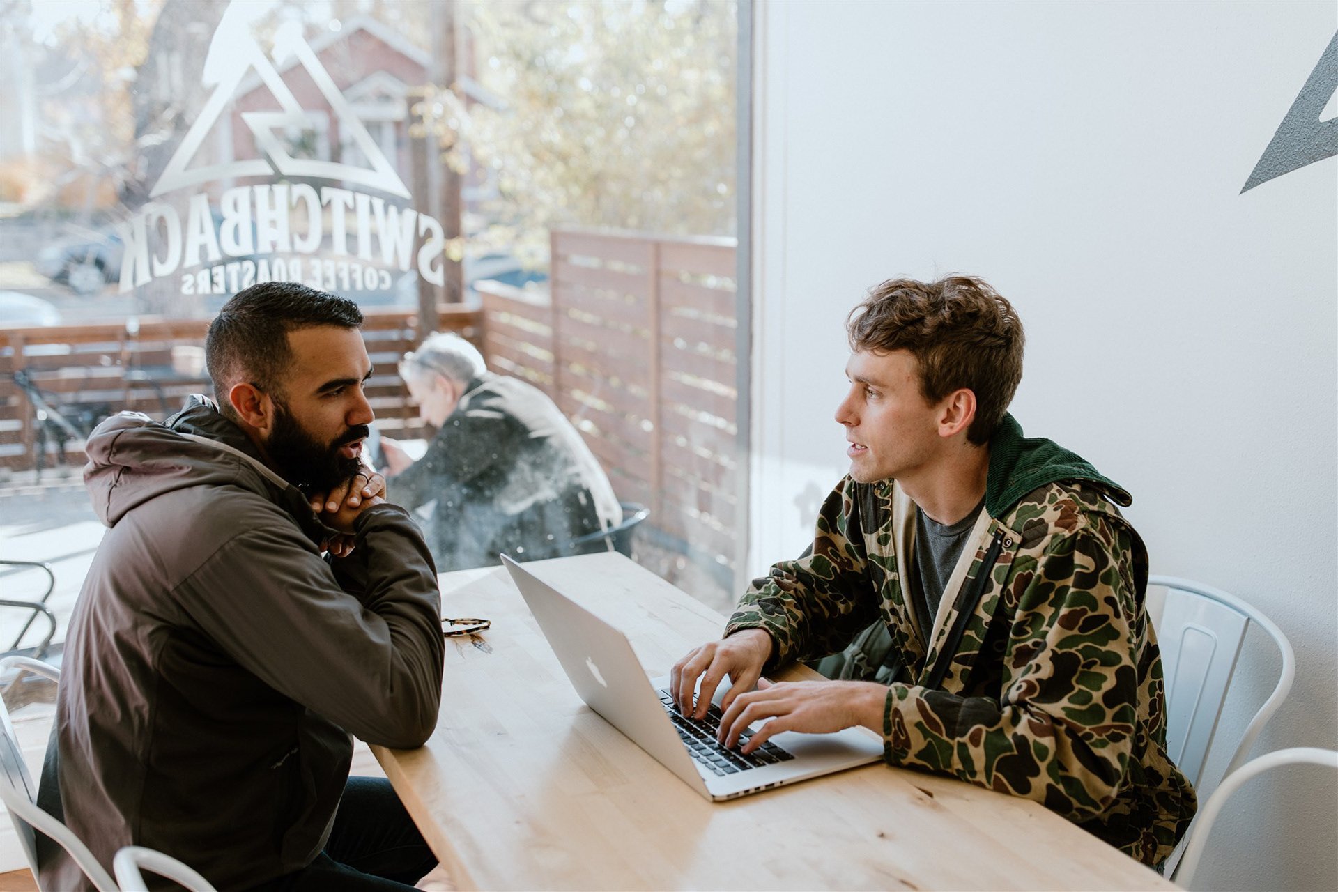
I then conducted 7 one-on-one interviews (virtual and in-person) with survey respondents who stated they had attended an art museum in the last 6 months.
During the interviews, I asked questions related to what drew individuals to art museums, how these museums made them feel, and asked them to share about specific experiences they'd had while visiting art museums.

Pain Points
Data from the interviews was synthesized and 4 main pain points emerged.
These would influence and be the focus for my designs moving forward.
Navigation
Visitors have difficulty knowing where to begin and/or have difficulty finding what they need within the museum
Time
Time constraints limit what users can see and they feel frustrated if they miss something they wanted to see
Crowds
Art museums can draw large crowds which make it difficult to access information and physically see art
Technology
Existing museum aids and devices are often clunky, outdated, and make it difficult to freely explore the museum
User Personas
Using the 4 insights above and details about people I had spoken to, I created the persona of Cara who'd I'd keep in mind throughout the design process.
Cara is a busy mother and amateur art enthusiast who needs a strategy going into her visits because she has limited time and gets overwhelmed by the all there is to see.
User Journey Map
A user journey map was created to help break down the individual steps of navigating a museum, identify possible feelings that might be linked to those steps, and uncover possible opportunities for improvement.
These opportunities for improvement would help inform ideas for product features in the stages to follow.
Developing Solutions
Storyboards were drawn up to help visually describe and explore the propsed concept.
A competitive audit was conducted to examine how other companies might address these problems and I was able to determine where current solutions still weren’t addressing the needs of users like Cara.
My Design Concept: Create a mobile app for an art museum that allows users to prioritize what they see based on selected interests to help them get the most from their visit.
User Flows
While there would be several different ways of using the app, the main user workflow would be the custom tour creation and usage. User flows were created in Miro to plot each screen within the app.
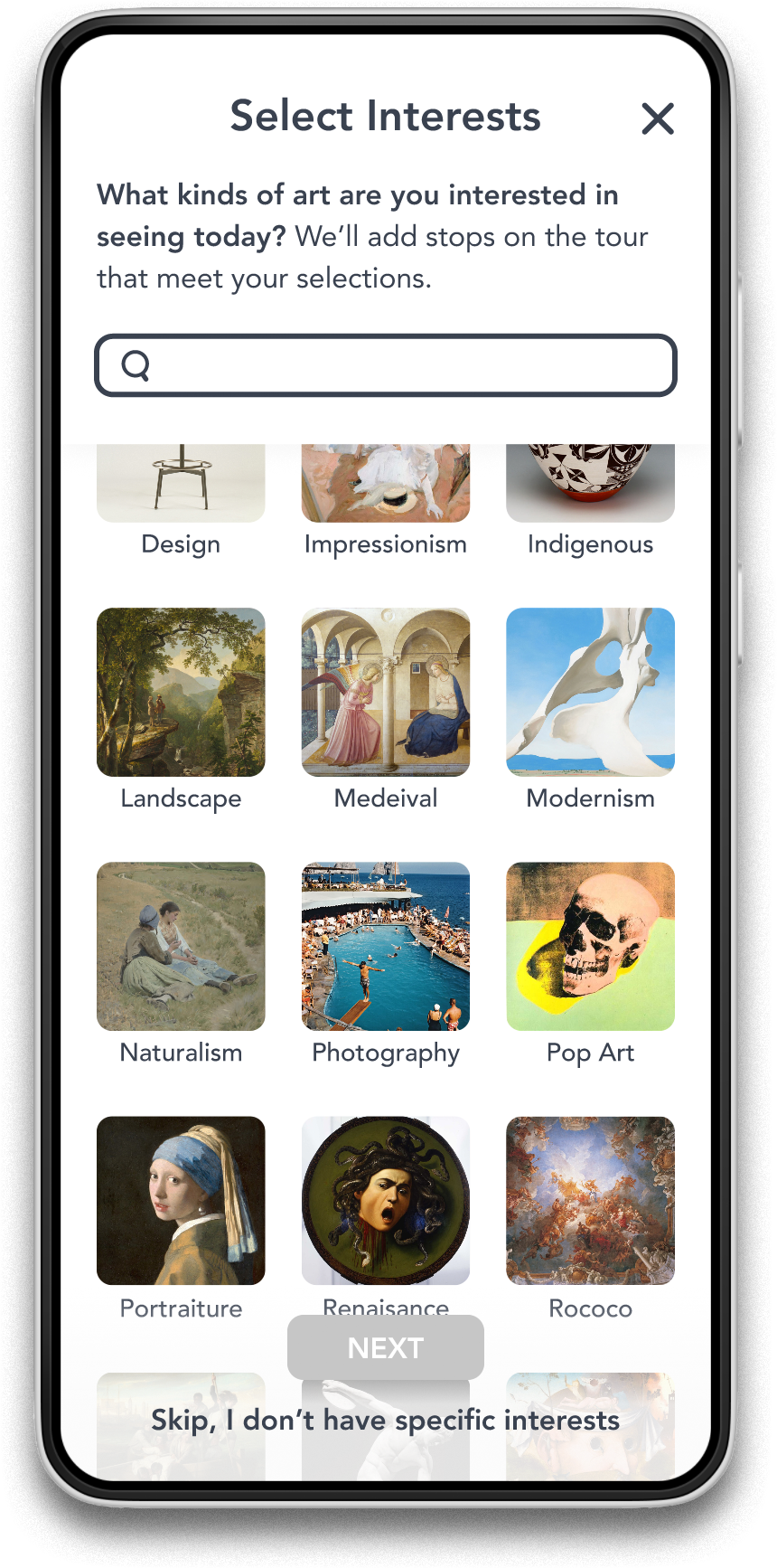
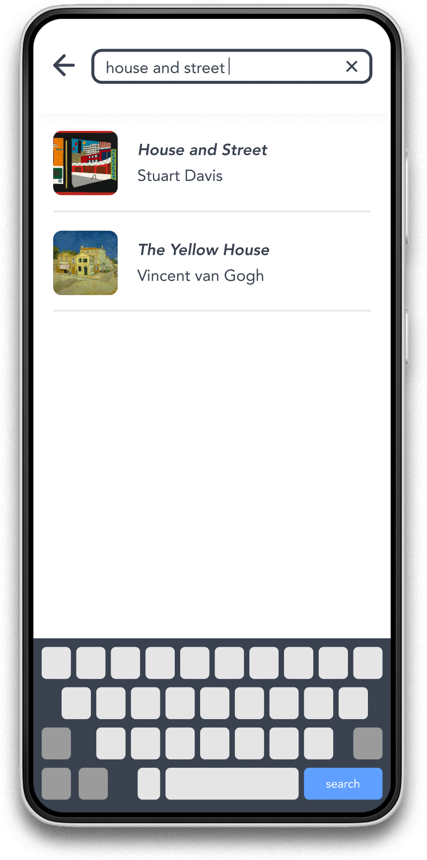
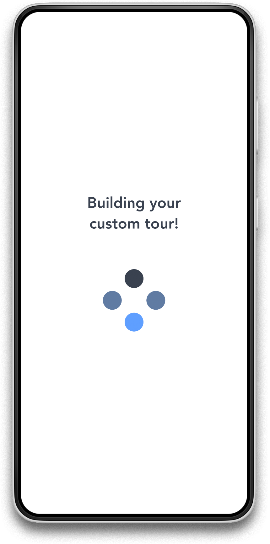
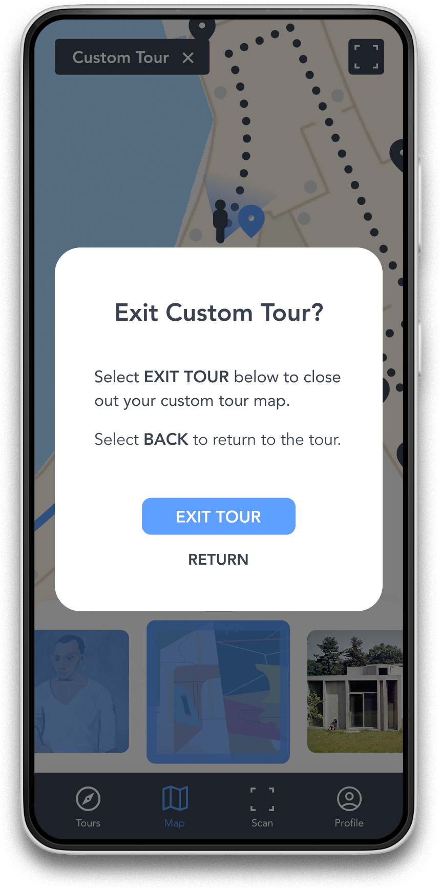
The "Custom Tour" feature would allow users to select general interests and specific priorities (individual pieces or exhibits). The app could then map out the most efficient route through the museum to ensure that the user gets to see everything they wanted.
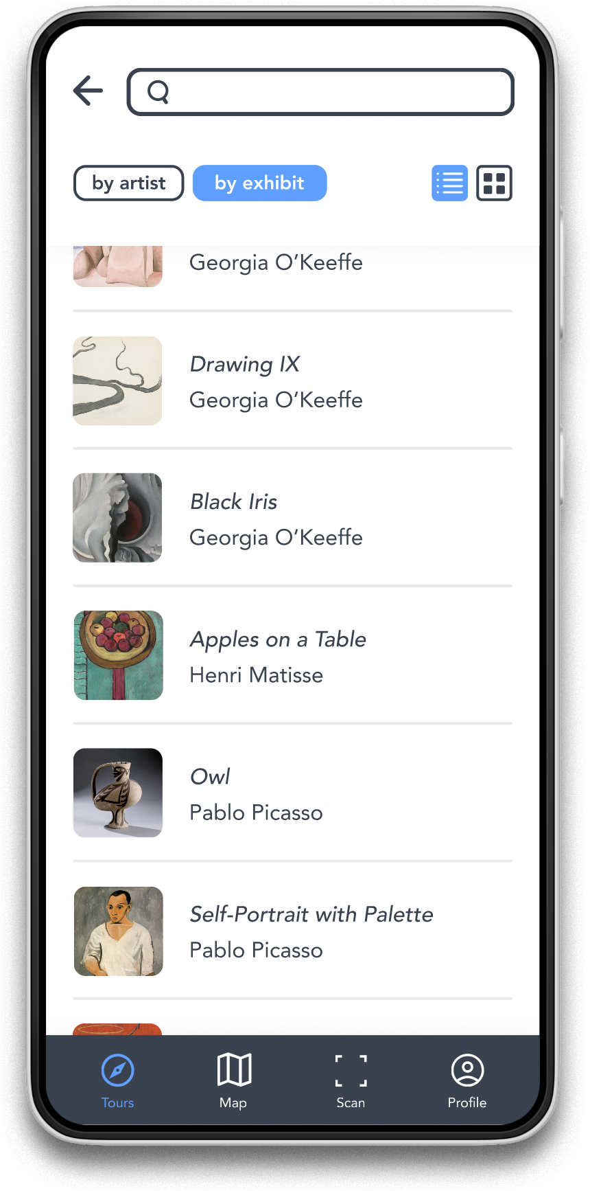
See something of interest that's not on the tour? Use the "Art Scan" feature to pull up information on demand for any piece in the museum.
Sketches & Wireframes
Each screen of the app was sketched by hand until I had paper wireframes to represent every major user flow.
After the paper wireframes were complete, it was time to convert them to digital wireframes and I’d be one step closer to a working prototype.
Testing the Prototype
Click HERE to access the actual usability study.
Once the digital wireframes were connected as a working low-fidelity prototype, it was time to put a research plan together and run the prototype through some user testing.
I conducted 9 usability studies where participants were asked to complete a series of tasks that simulated their movement through a museum and used the prototype as their guide. The usability of the prototype was evaluated based on user error rates, time on task, and a system usability scale completed by participants after their tasks.
Insights from the study were used to compile the following improvements that needed to be made to the wireframes before continuing toward higher fidelity.
Insights from User Testing
-
Users are unable to navigate back to the custom tour after navigating to a different tab within the app.
The custom tour lives under the ‘Map’ tab, but that’s not apparent.
-
According to the System Usability Scale, the setup process for the custom tour wasn’t easy to use.
Users felt it unnecessarily complex and didn’t fully understand the process.
-
It was unclear if art information can be selected from items on the map or from thumbnails in the carousel.
This resulted in high mis-click rates.
-
Users search for the Art Scan feature on the tour map when it’s located in the floor navigation.
There’s something more intuitive about it existing as an icon on the map.
Visual Design & High Fidelity
Visual Design (UI)
Let the artwork speak for itself! The visual elements of Docent were kept minimal to allow the artwork to shine. The colors were kept cool and based around a blue color palette to help maintain a sense of peace and tranquility — feelings that users stated they seek in art museums.
A basic UI sticker sheet was created in Figma to help speed up the process of creating the high-fidelity versions of each screen in the app.
Mockups
The designs began to come to life as color, iconography, images, and finalized copy was added to each screen.
The next step in improving the fidelity would be to connect each screen and add basic animations so that a final round of user testing can be completed with a prototype that looks and feels like the real thing.
Testing in Hi-Fi
Click HERE to see the usability test in Maze.
Similar to the first round of tests from early on in the design process, I had 5 participants work through a series of tasks within the new high-fidelity prototype. The tasks covered the major workflows of the app including Custom Tour creation and navigation, using the Art Scan tool for items not included in the tour, and accessing audio content for specific works.
Overall, I received positive feedback on the designs, and 100% of users 'strongly agreed' that they'd be excited to use this product in an actual museum setting. With that being said, I also received excellent feedback on areas I could improve the product.
Round 2 Insights
Solutions
Final Product
Takeaways
Impact
Docent empowers the user to take control of their museum visit and experience art in a new and meaningful way.
One quote from user feedback:
“Very cool! Would be so helpful in real life, especially if you’re on a time crunch and have things you want to focus on."
What I Learned
Throughout this design process, I learned that you can’t get hung up on any particular design or solution. You have to be open to feedback from others (especially your users) and the best design will emerge eventually.

